2020.10 is the latest release from Pyramid Analytics. It extends the functionality introduced in our major 2020 release. This is one in a series of posts that highlights some of the major new features.
The new Present Lite tool is designed to create quick and easy dashboards for non-technical users. Users will experience a simplified UI with fewer advanced features. However, they will get all the essential tools required for creating self-service, self-built dashboards. The Present Pro experience remains available for more proficient users who want to take dashboards to another level with advanced options and functions.
The problem
Building simple dashboards often necessitates additional technical BI resources, resulting in further bottlenecks and extra budget. Business users and analysts with no experience in BI tools are often overwhelmed and confused by the plethora of functions and options available in advanced dashboarding tools needed to create curated, guided analytic content. Most BI tools either offer overly simplistic dashboard authoring tools or very complex and advanced toolsets. This means that their solution can only usually keep one set of constituents happy.
The solution
With 2020.10, Pyramid now offers two interfaces for building dashboards: Present Pro or the new Present Lite. Present Lite provides an intuitive, uncluttered interface enabling non-technical users to build dashboards quickly and easily for themselves. All essential functions and designs are available with the lite version, while more complicated and intricate requirements can be fine-tuned by more experienced users on the same dashboard in the Pro experience. With a click of a button, users can easily progress to Present Pro, which includes elegant advanced features with simple point-and-click simplicity in an attractive graphical interface.
Business case
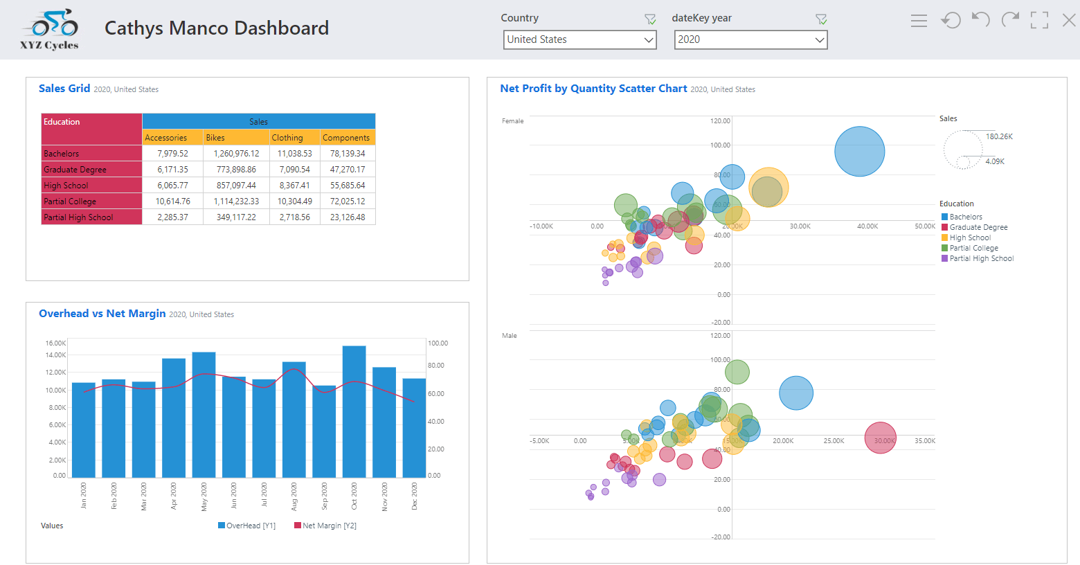
Cathy has recently been hired as a business analyst at XYZ Cycles.Her company is using Pyramid to deliver analytics on their Snowflake data warehouse. She has a working knowledge of analytical and visualization tools but has never built dashboards. Cathy wants to build three visualizations, a sales grid, a net profit graph, and a map of returns, with common slicers for month and country. She can get to work immediately creating her own dashboards using Pyramid’s lite dashboard builder, Present Lite.
The Present Lite module consists of three complementary functions for quickly building and inserting dashboard content: Smart Reporting, Discover Lite, and inserting existing content. Additional buttons provide further options for adding slicers, adding and formatting text, images, and shapes—even applying standardized themes.
Smart Reporting
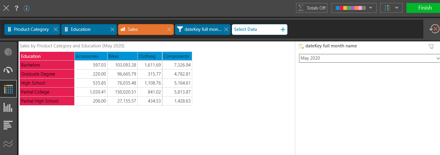
The Smart Reporting wizard allows users to simply add the required measures and hierarchies, and Pyramid will present your data in the appropriate visualization. Based on an AI-driven ”smart” engine, it presents the user with a streamlined interface, consisting of the report canvas, the visualization menu, and a single unified drop zone. There’s also a simplified design theme menu. In this example, Cathy builds a quick sales grid by selecting the product category and education attributes, the sales measure. She then selects the month date field as the filter and clicks on the finish button and her first visual has been added to her dashboard.

Discover Lite
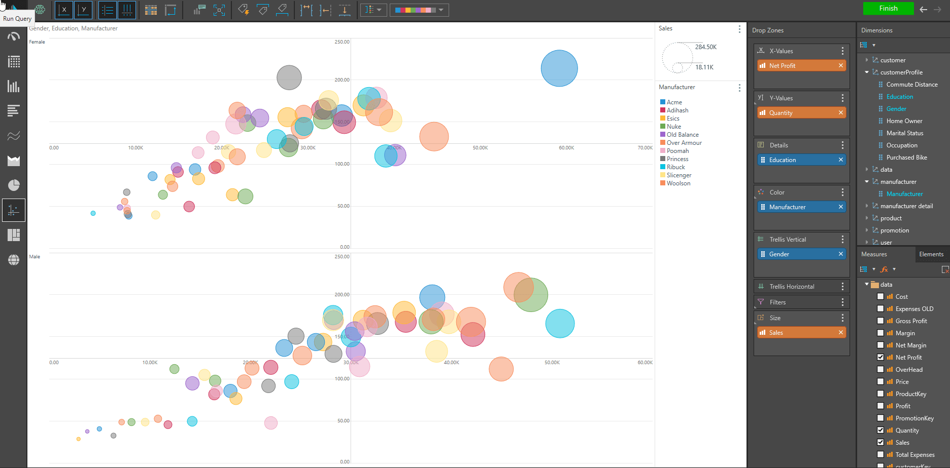
The Discover Lite tool also provides a streamlined interface where users can quickly analyze data on the fly, but it provides more options in determining the layout and selections driving the visual. In this example, Cathy creates a net profit graph by dragging and dropping the dimension and value chips into the drop zones. By clicking on the “Finish” button, Cathy has automatically added her second visualization to the dashboard.

Existing content
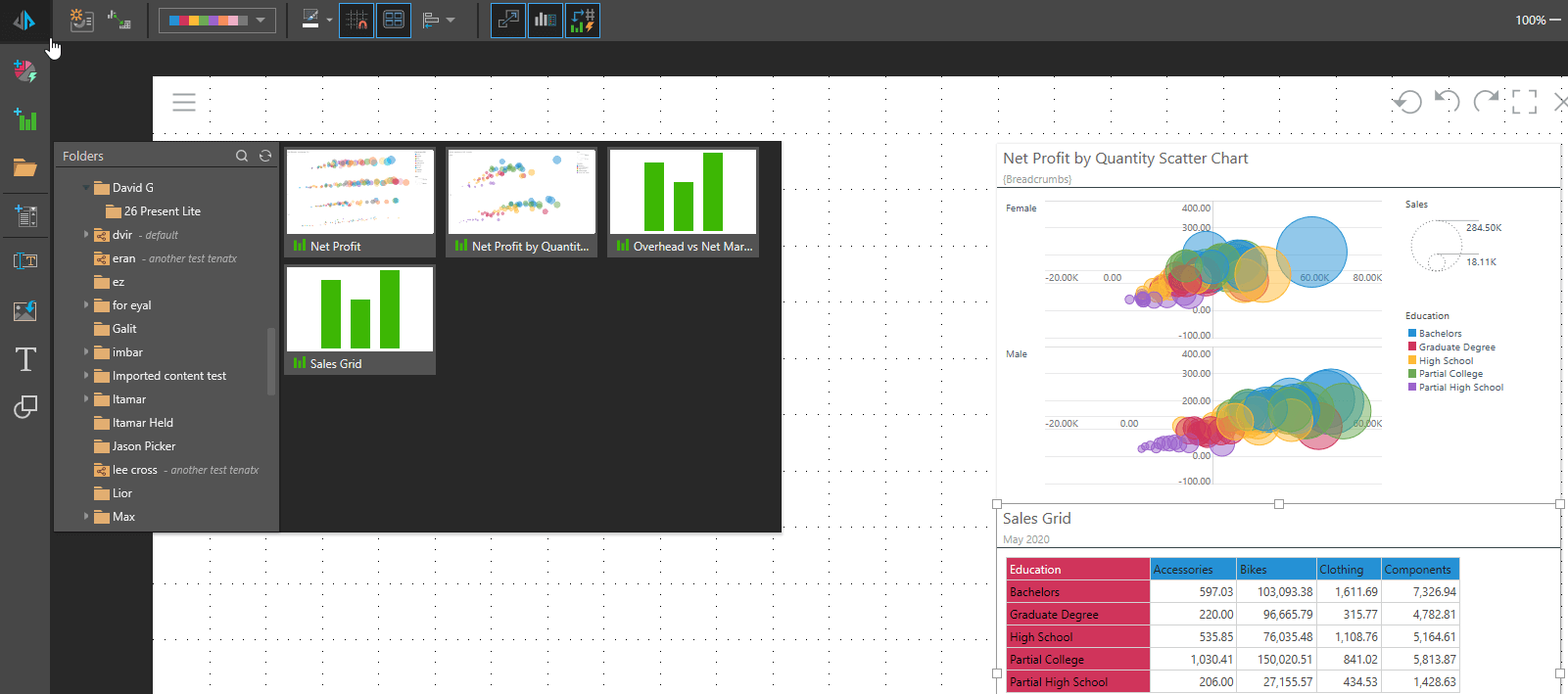
Previously created reports (from previous sessions or other users) can also easily be incorporated onto the canvas from the content folders with a simple drag and drop—enabling quick and easy re-use of existing content. Cathy now opens the “David G” folder and clicks on a previously created report of overhead expenses versus net margin to insert onto her dashboard.

Slicers
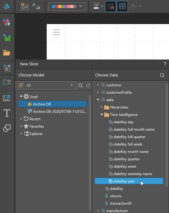
Cathy then wants to add slicers for Country and Year, so she clicks on the “add slicers” button and selects the Year Column. The year slicer is added to her dashboard and automatically interacts with all the visuals on her dashboard.

Cathy then adds an additional country slider to her dashboard.
Graphic image
In order to complete her dashboard, Cathy then adds a heading by clicking on the text button and typing and formatting her heading using Present Lite’s easy graphic interface. Lastly, Cathy imports a logo using the “Import Image” button, and her dashboard is complete.

In under ten minutes Cathy has created a dashboard with a heading and a logo, created two visuals, imported a third visual, and has added two slicers to her dashboard. All of this has been achieved without any training, or technical assistance, due to Pyramid’s quick and powerful Present Lite tool. The same dashboard can then be further enhanced using the Present Pro tool.
Summary
The new Present Lite tool enables non-technical users to create quick and easy dashboards in a simplified UI while providing all the essential tools required. While many competitor tools either cater to non-technical or very technical users only, Pyramid delivers the best of both worlds: an intuitive interface for entry-level analysts plus an advanced version that provides elegant advanced features using simple point and click simplicity in an attractive graphical interface.
2020.10 new feature series:
Pyramid 2020.10 is chock full of powerful features like Present Lite. For more detail about some of the other new headline features contained in the 2020.10 release, please see these additional write-ups:
- Post 1 – Calendar Slicer: The smart Calendar Slicer in Pyramid is designed to make date-time operations fast and simple for both novice and advanced users alike. It is especially useful when more date-time structures in the original data source do not exist and users do not want to use complex formulas to filter data with dates.
- Post 2 – Ragged Queries: The ragged query feature in Pyramid helps users create highly complex views of data, allowing them to easily “laser” out content items they do not want to see in a report—effectively building an “asymmetric” query.
- Post 3 – Self-Building Data Catalogs: Pyramid provides users with a self-building and self-maintaining documentation mechanism for data and analytics. The ‘Data Catalog’ helps analysts and administrators to find the data or analytical assets that they need.
- Post 4 – Data Catalog Toolkit: Learn about Pyramid’s Structure Analyzer, Data Source Changer and Lineage tool, all of which provides a graphical, intuitive set of mechanisms to all the elements in the system, fully exploiting the power of centralized data and asset cataloging.
- Post 5 – Flow Grids and Flow Charts: The flow grid and flow chart tools in Pyramid are designed to dramatically extend the grid and chart capability for publications.
- Post 7 – Audit Logs: Pyramid’s Audit Trail provides users with a framework to track all changes made to key objects throughout the system – providing administrators with a clear view and history of when an object was created, changed or deleted, by date and by user.
- Post 8 – Datavard Glue: Pyramid now integrates seamlessly with Datavard’s “Glue” – a third-party tool that allows users to trigger and extract raw SAP ERP data. The data can then be ingested into Pyramid by end users for further analysis and reporting.
- Post 9 – Content Migration: Pyramid users can easily migrate content from one Pyramid instance to another with an easy, intuitive wizard assisting them through the process. This facilitates re-use of content items with efficient processes to ensure governance and security.


