In part 3 of my blog series on contextual calculations (see part one and part two), I cover the powerful ability to calculate differences between current and previous row values for a metric and graphically display results in a waterfall chart.
Differences between two metrics are very commonly used to analyze period-on-period changes. Calculating differences often highlights other issues that require further investigation.
The problem
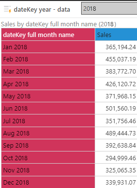
A business user is reviewing monthly sales figures and would like to see the “ups” and “downs” in the numbers as the year has unfolded. In order to achieve this, he would like to see the movements in sales represented in a data visual that is easy for him to grasp the trend.
Waterfall chart
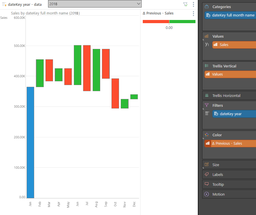
In our example the business user might want to graphically depict the differences in a waterfall chart that is a great visual to see movements highlights while showing increasing amounts in green and decreasing amounts in red.
The headache found in most BI tools
In most BI tools, this involves tricky coding that requires multiple, complicated, and time-consuming steps. For example, building differential values and waterfall charts in Power BI can be a long and challenging process. Worse, the solution offers no flexibility and hard-codes elements of the query.
With Pyramid you can create an additional calculated difference column in a simple, one-click step with no code required—while still leaving the user the capability to change the calculations intact.
Metric differences in a single click

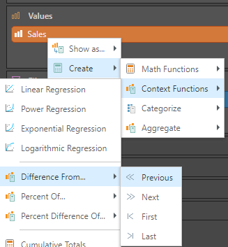
With a single right click on the sales metric, we can choose a differential calculation.

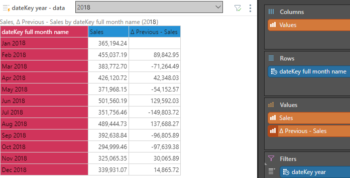
And the period-on period sales difference is instantly shown in our grid visualization.

With one more click, we can use Pyramid’s out-of-the-box waterfall chart to draw both the movements and the color of the movements in a graphic.

For details on this process you can see the video or help here.
Conclusion
With Pyramid, a user can create a difference calculation that:
- Does not need developer assistance
- Only requires a few clicks
- Can use the same definition without requiring additional definitions when he decides to analyze by different period type (or any other dimension)
Pyramid provides a highly versatile, powerful, code-free and user-friendly tool for calculating numerous business analytic applications and reports.


