While Pyramid includes over 50 core visuals out-of-the-box (that can be extended to over 200 variations), it also offers the option to build and integrate custom visuals into the platform to be easily reused and shared within the organization.
Data visualization is the process of taking queried data and drawing it into a visual context, such as a map or graph. Visualizations are easier for the human brain to understand and make it easier to detect patterns, trends, and outliers in massive amounts of data.
Sometimes companies have bespoke visual requirements that cannot be achieved using standard or classic visualizations. Custom visuals allow customers to build their own graphic representation of data using modern programming constructs like D3 and Plotly in JavaScript.
The problem
Data can take on different patterns. Many different types of visualizations exist to depict each type of pattern best. Although there is an unlimited number of different types of visualizations, most visual requirements can be created with the most popular graphs and visualizations. However, highly bespoke visualizations either require overwhelmingly complex manipulations or cannot be delivered with any of the classic options.
While some BI tools only offer their limited set of visualizations, others allow the creation of custom visualizations through a highly technical process. And with those that do offer this facility, deploying the visualization to all users, keeping its logic and code centralized (for easy updating), or securing it to be used by the right users or tenants can be a major challenge.
Pyramid’s solution
Pyramid provides an extremely large library of core data visualizations, with new visuals constantly added—allowing for quick and easy visualizations for most requirements. Using the drop zones to manipulate the visual designs, it is possible to create over 200 chart variations in Pyramid without writing a single line of code.
However, in the event these options do not meet the needs of some exacting requirements, developers can write their own custom visual logic in JavaScript and deploy it on the platform for all users to access with point-and-click simplicity.
Customizable JavaScript logic (written with libraries like D3, Plotly, et cetera), interfacing with Pyramid’s Custom Visual API, can be used to both draw data and determine how the visual will change based on user interactions or use of the toolset—covering things like data, drop zones (query selections), styling, et cetera. Once a custom visual has been created in Pyramid, it can be applied to any report as if it were an existing standard visual like a column chart, pie chart, map, et cetera.
Custom visuals can be easily secured and shared with other users using the same content management system, providing a scalable visual perfectly suited for the global enterprise environment. And any changes made to the script or any other template component are automatically and immediately applied to any report using the custom visual across the platform. As such, custom visualization scripts are governed in Pyramid like any other part of the analytic fabric.
Business case
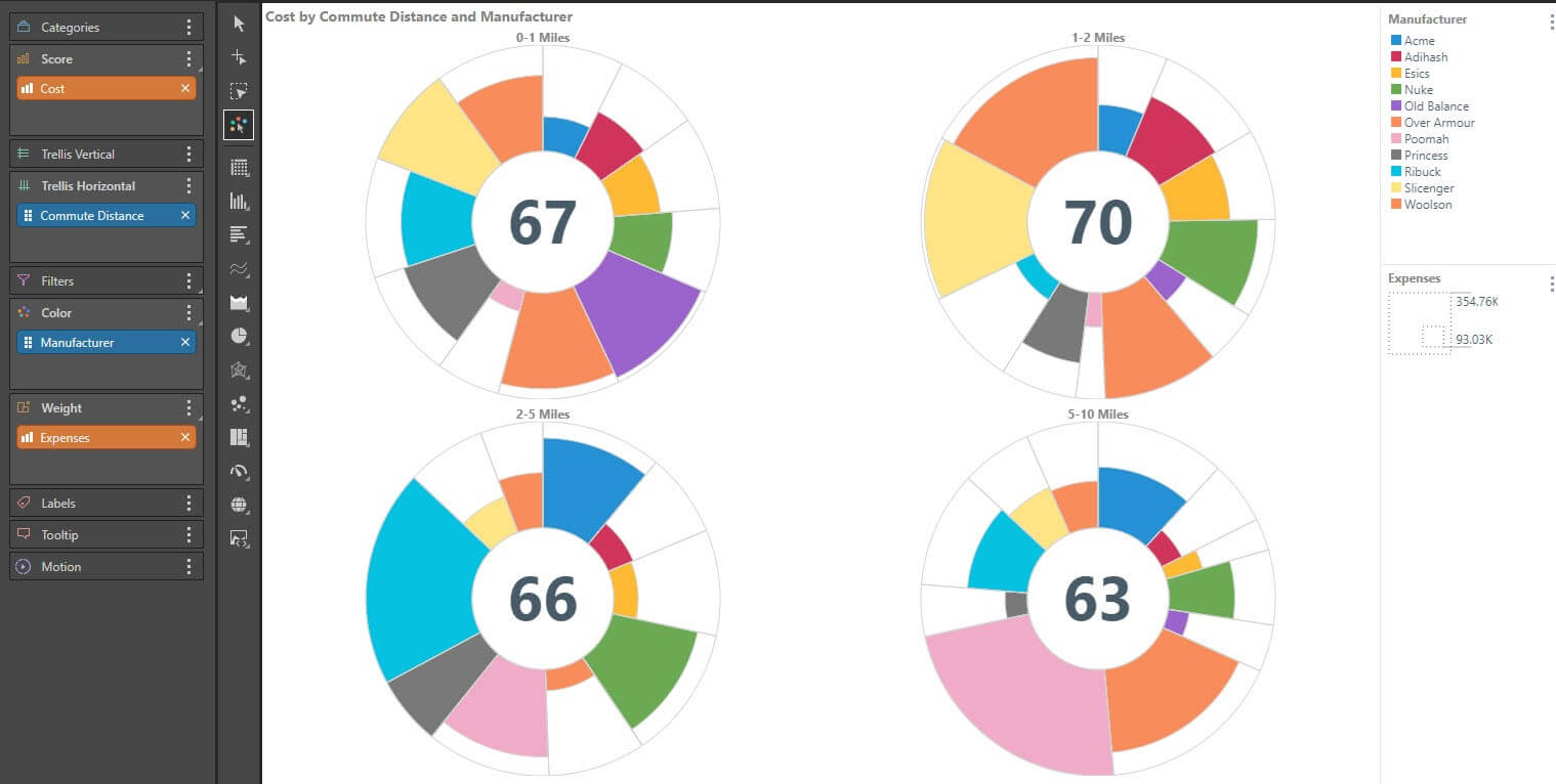
Jay is the BI developer for R & T Enterprises, where they have SAP BW, using Pyramid for their analytics. The logistics team wants to visualize costs per commute distance and manufacturer as a proportion of a whole, which can be visualized using a doughnut chart with each manufacturer as a different slice. They also want to view the expenses per category.
The doughnut chart can only display a single measure using the size of the slice, but an Aster Plot depicts an additional measure by displaying the slice’s height. As this is a common requirement in other areas, Jay wants to create a custom visualization to be used across the BI platform.
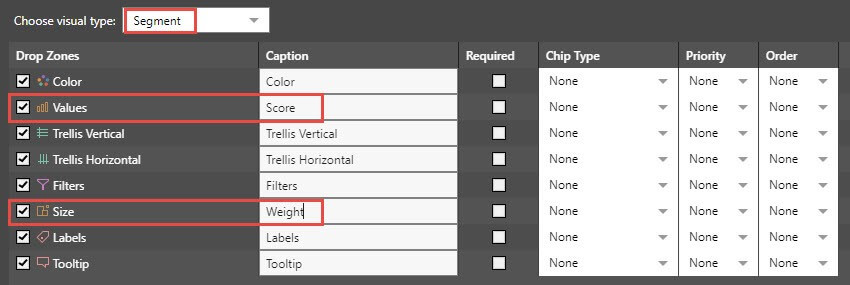
Jay initially sets up the definition for the visualization. He enters the Formulate module, selects the Custom Visual option, selects his testing data model, and then begins selecting his drop zones for the custom visual. Jay selects “Segment” as the chart template default and changes the “Values” caption to “Score,” and changes the ”Size” caption to “Weight.”

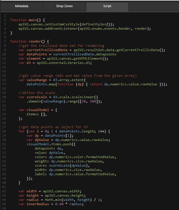
Jay’s JavaScript developer, Mary, has produced code containing the logic that will drive color, drop zone, and interaction logic for the Aster Plot visualization (she found the core logic online). Jay clicks on the script tab and copies her JavaScript logic into the editor.

Jay also has an SVG image that will be used as the icon template, so he clicks on the metadata tab, adds a name and description for his Aster Plot custom visualization, and uploads the SVG image.

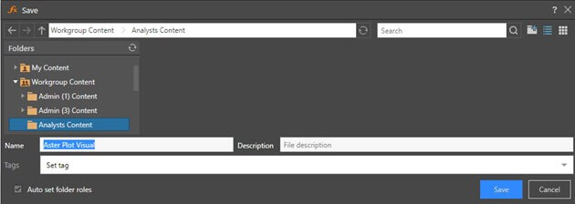
Jay then saves his Aster Plot definition in the Analysts Content folder—so all analysts with access to this folder can now access this shared visualization. (This takes advantage of Pyramid’s governance and security framework, inherent in the content management system).

Finally, Jay takes his existing Discover doughnut chart with costs as the only measure and converts it to an Aster Plot by simply clicking on the custom visual and choosing the new visual from the list. Jay also adds the additional expenses measure to be used to define the weight of the pie slice. The visual now encompasses both measures in a graphically pleasing and intuitive fashion.

Summary
Data visualization is the process of drawing queried data into visual contexts, making it quicker and easier to understand patterns and trends in data. Some visualizations cannot be fulfilled with core visualizations, requiring them to be custom-built. This is usually a highly technical process, and keeping such scripts or logic centralized, consistent, and secure is a major challenge.
Pyramid provides a large range of standard visualizations, with an option to extend them without writing a single line of code. However, it also allows JavaScript developers to create and deploy custom visuals using its built-in tools and APIs. The visuals then can be secured, shared, and used in Pyramid like any other analytic element.


