Data-driven text, like data-driven infographics, can help users better learn and understand new information. Data-driven text and messages can communicate analytical insights more effectively and complement classic data visualizations or images. They can drive specific ideas and thoughts to emphasize or highlight critical information. When used in combination with Pyramid’s other capabilities, dynamic text lets content creators drive personalized messaging using data.
Pyramid accomplishes this feat with an enormously powerful infographic tool— “Illustrate”—that builds dynamic data-driven text and images (covered in my previous blog post). These elements can be collaged and used with live, interactive presentations and in static report publications just like any other analytic content item in Pyramid.
The problem
Classic business charts and data visualizations don’t always tell the full story. Bringing in data-driven content in a different form can help crystallize the information. Images and text within presentations can convey a contextualized message, but it’s only useful if the text (and images) can be dynamically inserted, highlighting specific events or facts.
Further value can be added by applying logic, formulas, and additional formatting to the data-driven text. Text may also be conditionally displayed or hidden. However, the data required to determine what text to insert does not always exist in an accompanying report or dashboard—so having the flexibility to use other reports and data to drive the content that accompanies a visualization becomes necessary.
Writing and delivering data-driven text with this set of capabilities can be very difficult, if not impossible, in most BI tools. In many cases, injecting data-driven text requires significant coding time and effort. And when performed, reuse of the resultant dynamic text is not a feasible option. Customers are often forced to use third-party tools or plug-ins to deliver the functionality. (On the other hand, in some BI tools, this may be the core and only offering at the exclusion of almost everything else.)
Pyramid’s solution
Pyramid’s “Illustrate” app allows users to easily add data-driven text, accessing any data in one or more data models. Illustrate includes a comprehensive function list to manipulate query results, generate mathematical operations, derive statistics, and ultimately generate dynamic text that can include numerical values, conditional messages, and even text formatting.
When inserted into live presentation dashboards or published reports, the dynamic text can change in real-time as the underlying data is rendered or modified by the user’s interactions or changes in the underlying database. Best of all, it is fully integrated into Pyramid’s tight analytic pipeline—providing a master platform for centralizing, managing, governing, and securing data-driven text content, together with the rest of the analytic artifacts created in the platform.
Business case
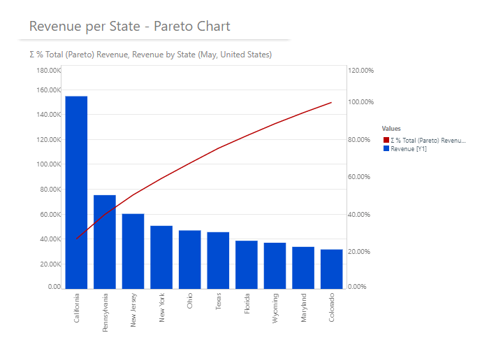
Toni, a business analyst at A&T Retail Inc., uses Pyramid to perform analytics on her ERP system housed in a Snowflake data warehouse. Toni uses a Pareto chart to graphically depict how the revenue for the top ten branches accumulates as a percentage of their combined revenue.

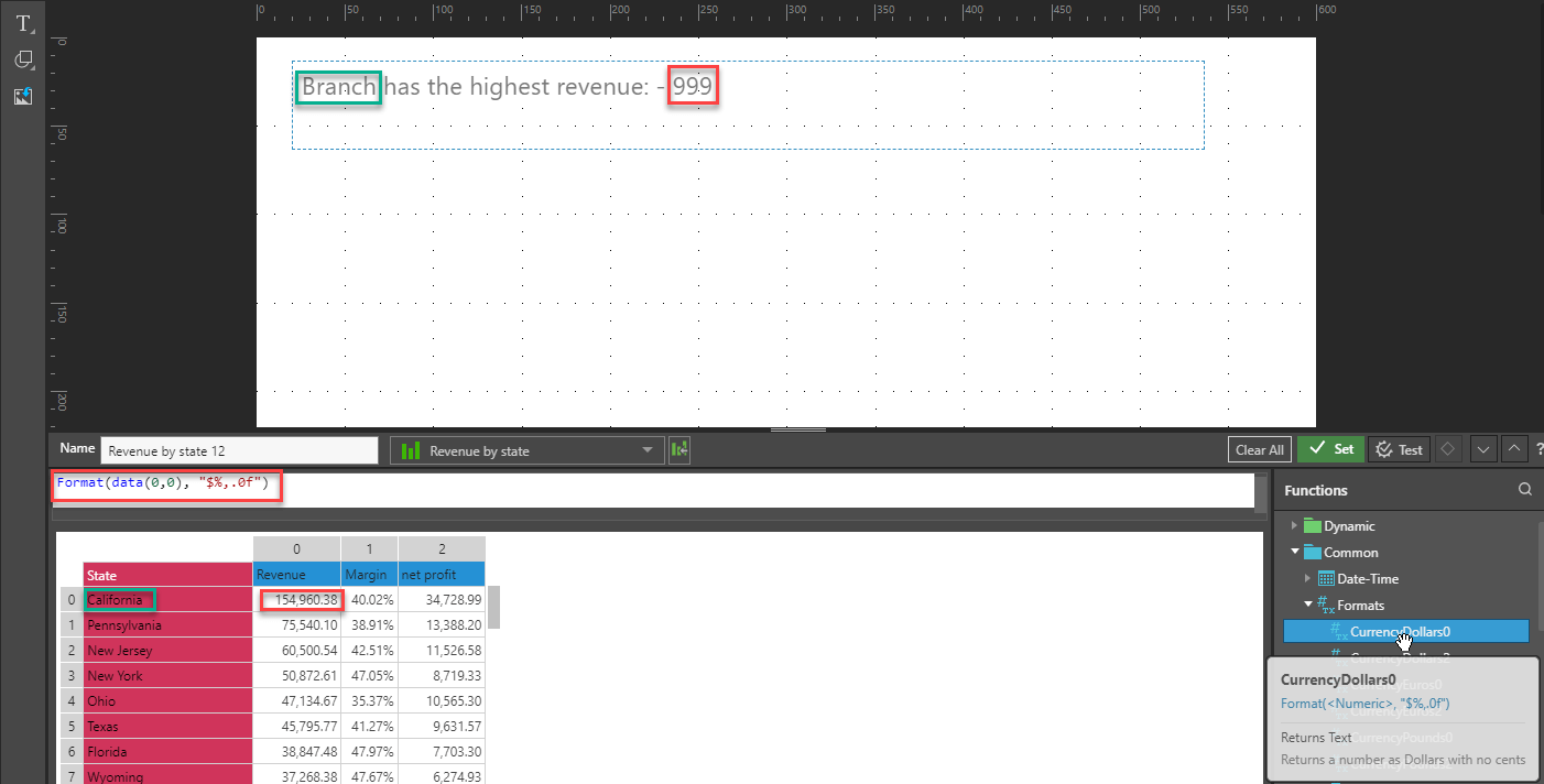
Toni wants to dynamically add a richer explanation for the best branch’s performance on her Pareto chart. She accesses the text tools in Illustrate and defines the “Revenue by State” grid to dynamically select the name of the best-performing branch. Toni then uses dynamic text to display the branch name and the revenue, using Pyramid’s formatting options, to produce the required format.

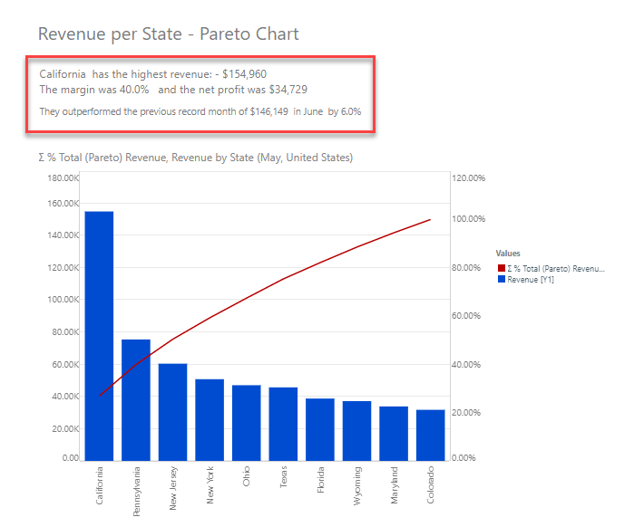
Toni then adds text for margin and net profit and dynamically accesses the amounts from the “Revenue by State grid,” applying the requisite formatting. Toni then provides additional, conditional text: if this is a new record month for the state, then it will add a comment displaying the previous record month and the calculated percentage increase. Once she builds the dynamic text, she uses Pyramid’s function list to calculate the percentage increase by subtracting the previous record month from the current record month, then dividing it by the previous record month and formatting it as a percentage.

Next, Toni makes the entire expression conditional on this month’s revenue is the highest amount, so the expression will only be displayed if it meets the condition.

And finally, Toni inserts the resultant Illustrate object into her existing Pareto chart, providing a richer explanation to accompany her report.

Summary
When data-driven text and images accompany classic business data visualizations, it can enrich an end-user’s understanding of the data and emphasize critical information. By injecting adjunct data (not presented in the original visualizations), or deriving statistics and calculations not evident in the original charts, you can give consumers deeper context.
While many BI tools either lack the capabilities to deliver dynamic, data-driven text or require a tremendous effort to produce it, Pyramid’s “Illustrate” tool provides a rich toolset to build and deliver this type of content for interactive presentations and published static reports. Schedule a demo today and see how Pyramid Analytics can help your business today!
Additional Resources:
📝 How to build data-driven infographics that tell a better story [Blog]
📖 Dynamic text for Illustrate [Help Guide]
📖 Dynamic text for presentations [Help Guide]
▶️ Illustrate – Dynamic Text:


