Pyramid’s persistent color feature maintains the same color in all visualizations for selected data elements, even after slicing or removing items from a chart.
Analysts often use specific colors to identify distinct hierarchies or measures in visualizations. Predetermined colors can be explicitly selected per hierarchy or measure, but this can be an arduous task when multiple hierarchies are displayed. Default color sets are routinely used by some BI tools to assign colors to categories. Pyramid provides additional flexibility by allowing default color sets to change when different themes are selected.
However, even when default sets are used, the color assignment can change for specific element selections (for example, New York could change from green to blue) when adjusting the query and the selections (like drilling down, or performing analysis using “analyze further”). This color change can be confusing, and even more baffling when two visualizations in a dashboard initially have the same legends and subsequently use disparate legends.
Pyramid’s “member color lock” feature ensures colors for the targeted items are persistent and do not change even if members are removed or slicing is performed.
Example
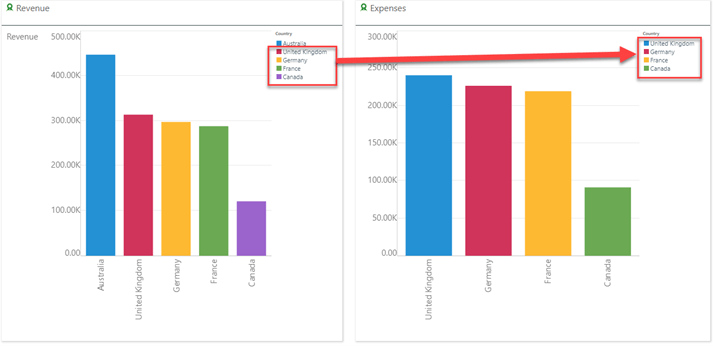
In this example dashboard, Australia appears in the Revenue column chart but has been removed from the Expenses column chart. So, for the chart on the right, the standard colors have re-assigned, and we end up with the same countries having two different colors.
 By simply selecting the member color lock button from the Design ribbon, the colors for the visuals are locked.

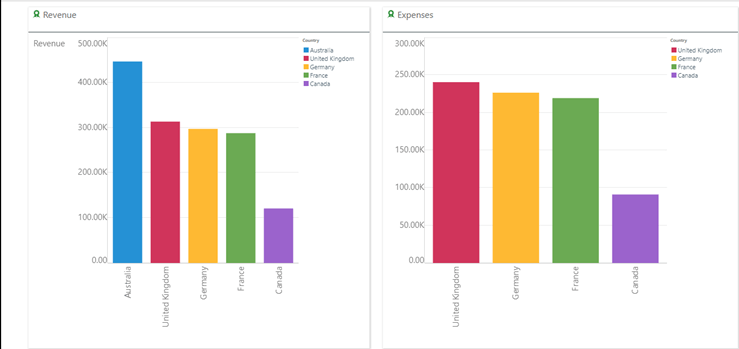
After locking the colors, the same colors persist even after eliminating members.

Summary
The use of specific colors helps users to immediately identify hierarchies, measures, and members in a visualization. After performing slicing or dicing, assigned colors can change, creating confusion.
Pyramid’s one-click persistent color feature maintains the same color in all visualizations, providing users with consistent and intuitive visualizations.


 By simply selecting the member color lock button from the Design ribbon, the colors for the visuals are locked.


